How I built this site
How not to build a site; or How I intended to build a simple one-page site and accidentally a static site with blogging and a gallery.
It is always so clear when one starts. In my case, I was wanting something simple but with a bit more personalisation than one of those carrd or linktree etc type of sites (no shade against those sites or the users who use them). I decided to go with a single page with links, some info and such, and (for reasons) decided to build it in python's flask and "freeze" the dynamic page into a pure HTML site. The problem with this came when I after a month wanted to edit it, and couldn't remember how to build the site at all. Not to mention that it felt a bit overkill! Which is why I decided to look for another static site generator.
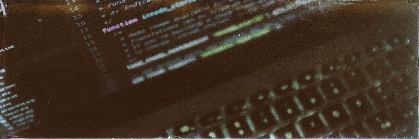
After going through several ideas I settled on Metalsmith.io, which is a NodeJS-based on. You can do it with either (to quote their site) "configuration over code" or "code over configuration", where I prefer the latter. In the index.js file I read in all the files in .src and (after various things being done to them) copy them to .build. My specific stack is Markdown files for the content, Handlebars as the templating language and TailwindCSS with PostCSS for the layout.
The three cornerstones for this site is:
Design choices
TailwindCSS is a good option for rapid prototyping, and to keep things fairly simple I went with only the colour "slate" in different shades. It's a blue-toned gray that gives a muted background to both the quite colourful gallery and the brown-toned images I'm using for featured images on posts and on some page headers. The idea is to eventually give all pages page header images, too, but I want to get the site ready sooner rather than later.
For typefaces I settled on the serif Cormorant for the headers and a few other details, and the sans-serif Montserrat for the body texts. Both typefaces have much personality and I feel they complement each other well: Montserrat has large, open letters perfect for reading, without much decoration apart from the shapes, and Cormorant has varying line widths and little flourishes on even the simplest of letters. One thing to keep in mind, however, is that Cormorant's x-height is quite shorter than Montserrat (x vs x). To put that in numbers: My body text is about 18px. For the Cormorant x to be the same height as the Montserrat, it needs to be about 24px. However, at 24px any ascenders will tower above their Montserrat counterparts and descenders will be far below. Most of the time they don't need to be the same size, but in the cases where they're next to each other I've raised the size of Cormorant to 20px vs Montserrat's 18px.
Cormorant
Cormorant is a Claude Garamont-inspired type family by Christian Thalmann, putting it firmly in the old-style type of serifs. Its italic ampersand (&) is one of my favourite characters. Both italic and roman characters have interesting details, like the tilt of the letter o, the high bar on the letter e and the ball terminal of the letters f and c.
I've always loved serifs, and Cormorant is a beautifully crafted one which is even open source. There are other open source Garamond-based typefaces, but as a display font I prefer the variance in characters of Cormorant.
Montserrat
Meanwhile, Montserrat is a beautifully geometric typeface. It was inspired by signs in Buenos Aires and originally designed by Julieta Ulanovsky, though it was redrawn by Jacques Le Bailly in 2017. Of sans-serif typefaces, I tend to avoid neo-grotesque ones (Helvetica and Arial are two common ones in that category), but I like both geometric (Futura, Montserrat) and humanist (Verdana, Calibri, Droid Sans) ones. I decided on Montserrat since it contrasts well with Cormorant--one of the draws of humanist typefaces is that they have forms often associated with serif typefaces. What I like with Montserrat is how the bowl of the letters aobqpecd are the exact same form, giving a pleasing symmetry. It also manages to keep at least 0 and capital O from being too similar, even if it's almost impossible to tell the difference between I and l.
Creating featured images
While my art uses different techniques, for the featured images (whether for a post or page) I wanted to use a unified look. The pages have background images that are in a 6:1 scale and the posts are images in 3:1.
- Using free stock photos I find an image that fits my writing
- In Affinity Photo (AP) I crop it to the right ratios, adding small adjustments (like darkening or lightening) before exporting it to jpg
- With the exported image I load Analog Efex Pro 2 (AEP2; part of the free Nik Collections rather than the newer, paid-for Nik Collections). While I could run that in AP, I've noticed that it on my computer sometimes crashes, so that's why I do it in two steps. I expect that my effects are largely anachronistic in their composition, but that doesn't matter to me
- I adjust the basic settings of the image like Detail Extraction, Brightness and Contrast to make the image dark enough for my light text, and still visibly of the thing it was originally
- Using the Light Leak section I put in a bar of light ("Crisp" category) in the top-right corner
- In Dirt & Scratches the image gets aged with one of the Organic options
- Some more age is added with a Photo Plate Corroded texture
- With the Film Type options I add a nice brown-green tint to the image alongside a fair amount of graininess. This is one of my favourite parts of AEP2--the beautiful colours you get by adding old analog styles
- Finally a Lightbox texture under Frames to give the edges a "cracked glass" look
- Finally, I have a python script that uses ImageMagick to copy and resize the images, since especially the posts have several widths depending on the width of the screen.
Navigation: Main & Breadcrumbs
Both menu and breadcrumbs are coded using lists, since to me that makes the most sense. For the main nav it's an unordered list and the breadcrumbs use an ordered list. There's nothing really wrong about using either a) an unordered list for breadcrumbs or b) something that isn't a list, but since this site is about me indulging myself (and letting you all in on my thought processes) I went with what I preferred. Which is also why the items of the breadcrumbs are divided with », as li::after content.
A prior version of this design used a really cool menu, where when you clicked a particular button the main page would tilt and reveal the menu. It was really cool, but I ended up scrapping it because it was too finicky to get it to look right on even the small amount of pages I had, so the thought of how much it'd break at my future posts hurt my head. Instead I went with the option I'd always had for anyone who doesn't have javascript active, and while I miss the snazziness of the prior, the simplicity of a standard navbar felt like it fit my design principles more. It just works.
Index
This was the original one-page of the site. I wanted links, some calls to action to go to either of my shops and a small bio. It uses it's own template, since it even now has a lot of things none of the other pages have, like the generated links to my various online presence (taken from package.json) and widgets from RedBubble and Ko-Fi. I did have a Twitter widget a while, but since I am a lot more active on Mastodon than I am Twitter, it was one of the things that I removed when building up more of the site.
Gallery
I have most of my digital art up on Ko-Fi as well, but I wanted to have them on my own site as well, since that allows me a bit more leeway in how I display them. Since I do offer up downloads of my art in high quality to my monthly supporters, I also wanted to keep the "full size" images small enough to not compete with that.
The first look on the gallery is a masonry-esque page filled with thumbnails. To be able to have that layout without adding extra javascript I made all thumbnails be 350px wide, with varying height. If you don't use javascript, the thumbnail will lead to the larger sized image, and if you do it will trigger the lightbox gallery (lightGallery.js). The full size is 650px at it's shortest side, rather than the width, since I realised that if I limited to a specific width the portrait-aligned images would be larger than the landscapes. While I do have a fondness for portrait-aligned art, not all of it is.
For the gallery images, I use the same script as for the featured images, but add a few more options. In particular, I have a gallery-metadata.json file with filenames mapped to metadata (like title, description and a few other things) which is combined with the sizes of the thumbnails and full images when the files are resized and cloned over to the directory where the site builder can use them.
I'd originally intended to make the image-handling script in nodejs as well, but after a bit of butting my head against async it occurred to me that no. I actually don't really need it to be async? Because I have few enough images that it doesn't take much time, and while I do regenerate the images before the building, that's when I do build-to-publish, not build-to-develop.
In the building script I combine the information from the (generated) gallery.json and the files in the gallery collection to create the Gallery page. It is not a page that is kind to bandwidth, with both more javascript and CSS (lightGallery) than other pages, and (at counting) 43 images. Each thumbnail (image on the page) is on average 45kB (biggest is 94kB, smallest is 21kb). The full sized images (not loaded on page load) are 145kB on average, with the biggest at 270kb and smallest 85kb.
Blog
The blogging capability is divided into two parts: Updates and Blog. Both use Metalsmith Collections, in different ways, and each have a root page that's generated in build by the script, rather than being their own files. The script bin/blog.js creates updates, blog and each tag (defined, again, in package.json), adding posts and other info as needed.
Updates
Updates can really only be called "microblogging", since it has short, dated items with what's going on in my life (whether personal or professional). The intention is to post a quick update at least weekly, where all of these are collected on a single page. I expect I will be either limiting the updates to a number (discarding the older ones) or add pagination later, but that is for Future!Me to worry about (because if I keep worrying about that, I'll never finish the first version).
Actual blog
A few things were a stumbling stone for me when I was setting up the blog. One was how I wanted to set up the url, and also what to call it. The first variant was Posts with an index page that showed all posts and then each post under posts/slug. The posts were defined from a collection, but that brought the additional issue that I had to make the regex for what counts as a "post" to not include posts/index.html. I also realised that I probably wanted tags, and I hadn't at that point figured out how to create pages from an object without starting with an actual file, so the tags were all saved as tags/tag-name. The advantage with that was that I could easily create a collection that were just tags (well ... at first they were categories, but I decided I preferred using the tags-taxonomy).
Each post (like this one!) is at their core a markdown file with yaml frontmatter, which includes the alt for the featured image, publication date and a few other important items. They use a shared blog/post template with next/previous pagination, links to the tags and some snazzy metadata, like the word count and estimated read time.